

Easy to add

Property panel

Collapse all when I expand

Collapse section on load

Simple heading
Spice up your content with accordions and collapsible sections.
** Please note ** this web part is not FREE, however by installing this web part, you will be granted a trial license. You may purchase this web part through the web part "Buy Now" button. For more information about the Accordion Heading web part, please refer to https://www.qualitem.com/products/web-parts/accordion-heading.
The Accordion Heading Web part is used in a SharePoint Modern page to enhance content and support expandable / collapsible content sections.
Accordions are typically used on longer pages where readers benefit by shortening the pages with sections that are expandable / collapsible at the heading. This reduces the scrolling and condenses the content by topic or heading, allowing the reader to quickly scan for the content of interest and expand the section to reveal the content.
Why use Accordion Heading Web part?
Using headings will help you to organise information on the page, it helps readers to quickly scan the page with topics. Allowing readers to have control over the content by expanding it or deferring it for later lets them decide what to read and what to ignore. Giving readers control is a human centred design approach.
Applying accordions to long, content-rich pages supports the idea that:
- Collapsing the page minimizes scrolling, reducing the information on a page.
- The headings help navigate the content and build a mental model by grouping into clickable sections.
- Both encourage readers to seek out content within the collapsed sections and also make less daunting large amount of content on one page.
- Keeping the user on the same page by using an accordion to consolidate large content may be a better alternative to page links. Linking off to sub-pages is problematic as it breaks people’s mental model of the content; clicking a link will load a new page and therefore disconnects from the original accordion content. The Accordion Heading Web part offers an easy way to manage and style your headings in a SharePoint modern page.
| Version | Release date | ||
|---|---|---|---|
| 2.0.1.0 | Latest stable | Friday, June 25, 2021 | |
| 2.0.0.0 | Friday, April 30, 2021 | ||
How to use Qualitem’s Accordion Heading Web part?
Introduction
The Accordion Heading Web part is used in a SharePoint Modern page to enhance content and support expandable / collapsible content sections.
Accordions are typically used on longer pages where readers benefit by shortening the pages with sections that are expandable / collapsible at the heading. This reduces the scrolling and condenses the content by topic or heading, allowing the reader to quickly scan for the content of interest and expand the section to reveal the content.
Why use Accordion Heading Web part?
Using headings will help you to organise information on the page, it helps readers to quickly scan the page with topics. Allowing readers to have control over the content by expanding it or deferring it for later lets them decide what to read and what to ignore. Giving readers control is a human centred design approach.
Applying accordions to long, content-rich pages supports the idea that:
- Collapsing the page minimizes scrolling, reducing the information on a page.
- The headings help navigate the content and build a mental model by grouping into clickable sections.
- Both encourage readers to seek out content within the collapsed sections and also make less daunting large amount of content on one page.
- Keeping the user on the same page by using an accordion to consolidate large content may be a better alternative to page links. Linking off to sub-pages is problematic as it breaks people’s mental model of the content; clicking a link will load a new page and therefore disconnects from the original accordion content. The Accordion Heading Web part offers an easy way to manage and style your headings in a SharePoint modern page.
Installing the Qualitem Accordion Heading Web part
Click on install now button to quickly and easily install Qualitem’s Accordion Heading Web part.

Adding Accordion Heading Web part to your page
Once installed into your SharePoint Online tenant, you can easily add this web part to each section of a SharePoint modern page. This is added to a modern page like any other web part.
To add the Accordion Heading Web part to a page:
Please refer to this link for more information on how to add a web part.
- If the page is not already in edit mode, click Edit at the top right of the page.
- Hover your mouse above or below an existing web part in the section and you'll see a line with a circled +, like this:

- Click + and you'll see a list of web parts to choose from.
- To easily find the web part you're looking for, start typing in the Search box.
- Type the word “Accordion” and the following will display:
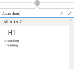
- Select the “H1 Accordion Heading” to add it to the page.
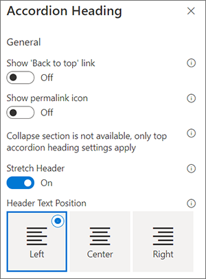
Configure Accordion Heading Web part settings
The settings are used to change the behaviour of the web part.
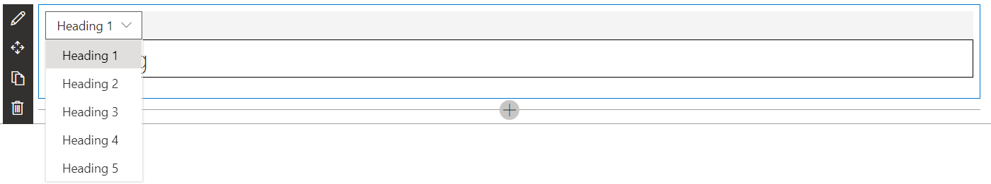
Heading style dropdown
The heading dropdown supports changing the size of the heading text to match the out-of-box styling of each heading level.
Default settings - simple heading text
By default this web part is customized to add a simple heading style (not collapsible). All accordion features are disabled by default and the heading text is treated the same as type a heading in to a Text web part.
Note: The help buttons (i) next to each setting provides additional information.
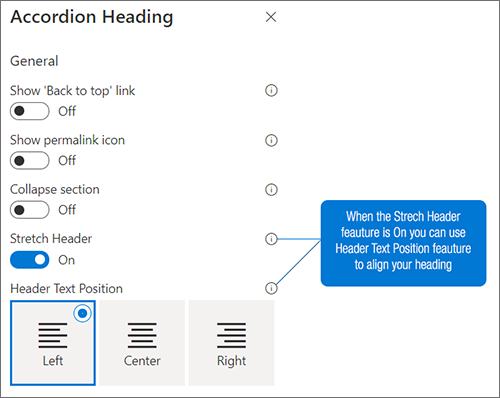
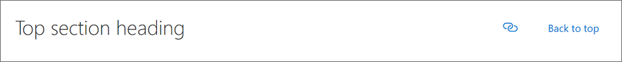
Heading with ‘Back to top’, Show Permalink icon and Layout
You can add “Back to top” or permalink icon to web part. It helps you to access top of the page or get a link (#) to your heading.
With “Show permalink icon”, you may enable or disable the permalink in your heading. A permalink is a static hyperlink to either a web page or a particular heading on web page that directly positions the user to the heading location.
You can also select the preferred permalink slug name. The slug name is the reference name. If you leave the slug name blank, the web part will insert a placeholder name for you by using your current heading text.
The Layout feature aligns either the “back to top” link and/or “permalink icon” on the left or right.
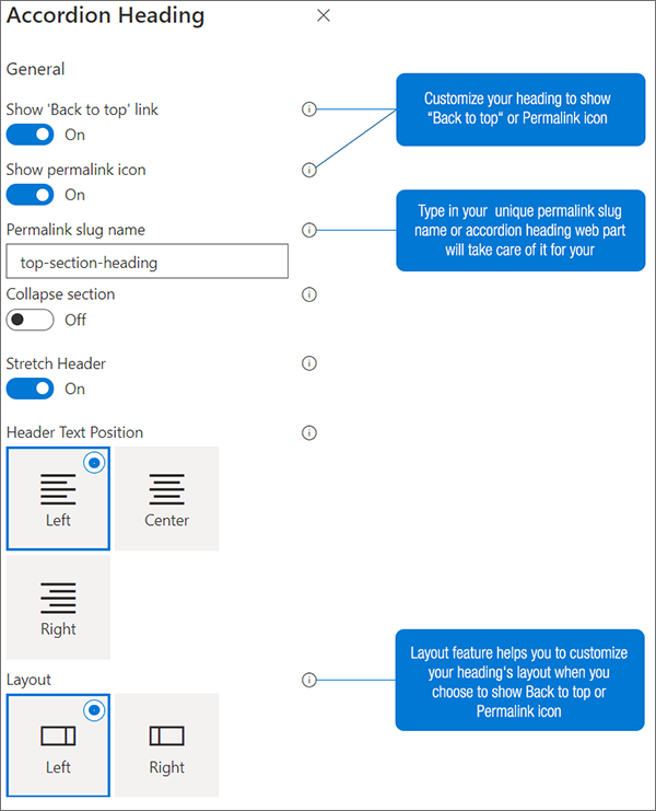
The following images depicts the “back to top”, permalink icon and left justified layout as selected:
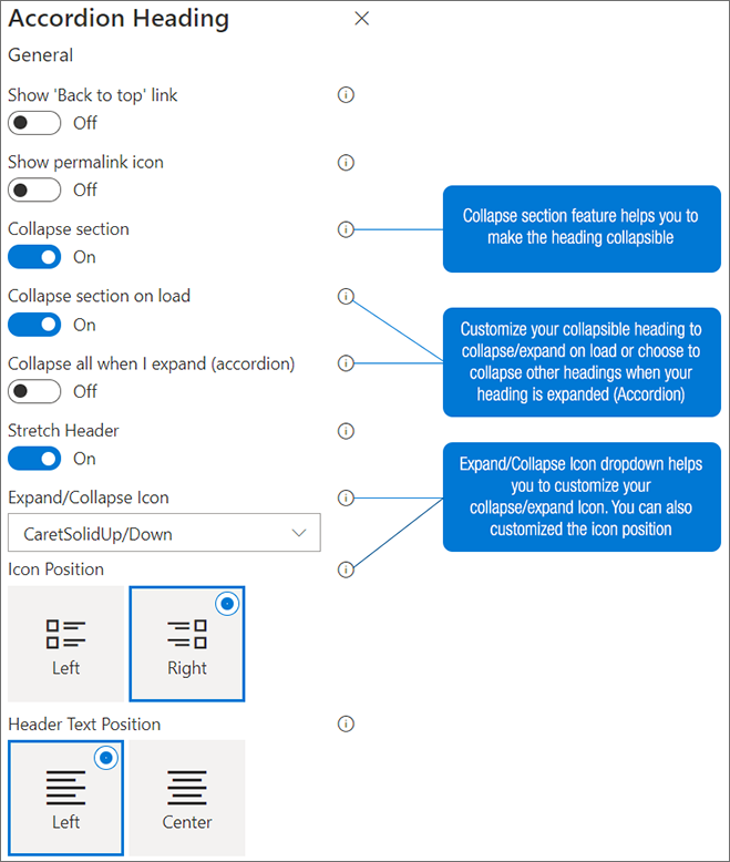
Collapsible Heading
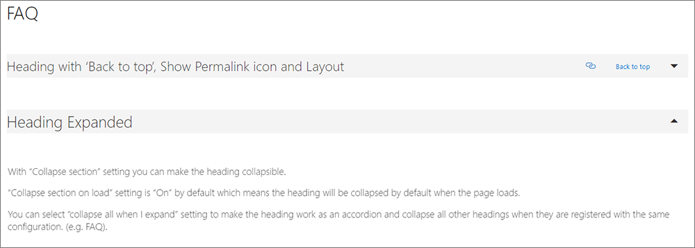
With “Collapse section” setting you can make the heading collapsible. “Collapse section on load” setting is “On” by default which means the heading will be collapsed by default when the page loads. You can select “collapse all when I expand” setting to make the heading work as an accordion and collapse all other headings when they are registered with the same configuration. (e.g. FAQ).
Collapsed
The following image depicts a collapsed section and its heading.

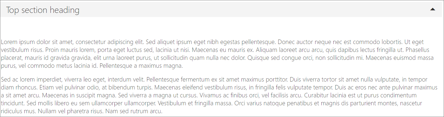
Expanded
The following image depicts an expanded section and its heading.
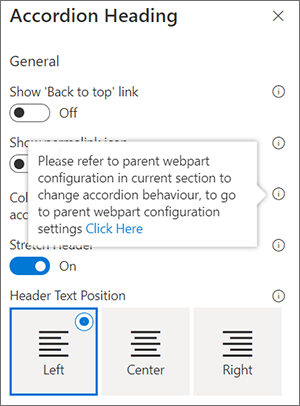
Note: Only one heading can be collapsible in each section on the page, therefore if you add more than one Accordion Heading Web part to the same section, you get the following settings in the subsequent accordion web part settings. To configure the parent Accordion Heading Web part, click on (i) to navigate to the parent configuration settings.
|  |
|  |
|
Do more with Qualitem!
Extend SharePoint Online with one of our other content-focused web parts in the Qualitem Marketplace, such as:
Table of Contents Web part: Add a table of contents on your page to help navigate using your headings.
Source Code Web part: For technical documentation, add our source code web part to document code snippets.